Imagine a world where the color of your favorite brand’s packaging changes with every purchase. Confusing, right?
This was the reality before Lawrence Herbert dubbed the “King of Color,” transformed Pantone from a small printing company into a global color consistency powerhouse.
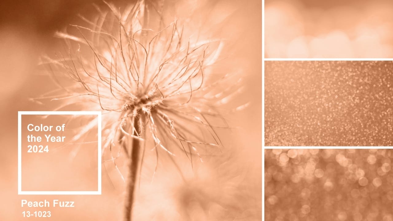
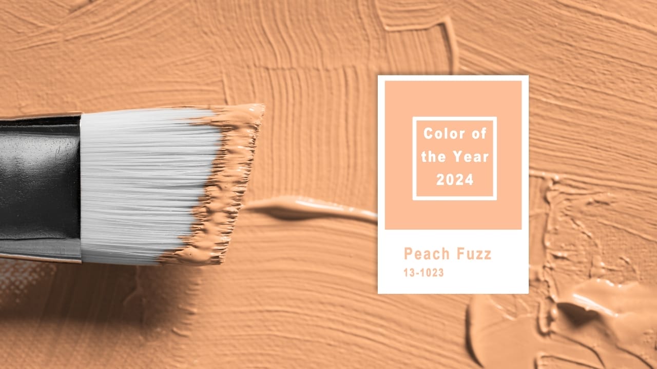
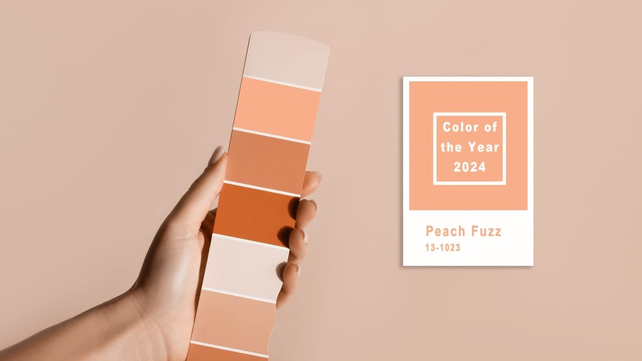
In 2024, while Pantone’s “Peach Fuzz” is making headlines as the color of the year, the real story lies in how Pantone sells not just colors but a promise of uniformity.
The Birth of a Color Revolution

In 1956, Lawrence Herbert, a young chemistry graduate, joined Pantone, then a modest printing company. He quickly identified a major problem in the industry: inconsistent color reproduction.
This inconsistency was far from trivial; it significantly impacted consumer behavior and sales, a fact vividly illustrated by Kodak’s dilemma. Kodak faced a unique challenge where their iconic yellow packaging varied in shade depending on the printing factory.
This variation made consumers mistakenly perceive darker-hued boxes as containing older, potentially outdated films. This misconception was detrimental to Kodak’s sales, as customers naturally gravitated towards boxes with a brighter yellow, assuming they were newer.
Herbert’s ingenious response to this industry-wide problem was developing a standardized set of formulas.
These formulas were designed to ensure that the color output remained uniform regardless of the factory or the material used, thereby maintaining brand integrity and consumer trust.
This innovation not only resolved Kodak’s issue but also set a new standard in color consistency, revolutionizing the printing and packaging industries.
The Color System
Fast forward 67 years, and Pantone has developed over 10,000 colors. But what Pantone really sells is the intellectual property of their color system.
This system ensures that color remains consistent, whether it’s on a ceramic mug or a billboard. The challenge of matching colors across various materials is complex but crucial for brand identity.
Think Tiffany blue – a color that instantly evokes the luxury brand.
The Rigorous Process Behind Color Consistency

Pantone’s dedication to color consistency is crucial in a world where brand identity hinges on visual perception. Their meticulous quality control, employing tools like spectrophotometers, ensures each color precisely matches its designated index.
This precision is essential for brands, as consistent color representation across various mediums – from physical packaging to digital platforms – is critical to maintaining brand integrity and recognition.
Inconsistent colors can lead to customer confusion and dilute brand identity.
For instance, a brand’s signature color appearing differently on a product package than its digital advertisement can undermine customer trust and brand loyalty. This consistency is not just about aesthetics; it’s a strategic business necessity.
Brands rely on Pantone’s system to ensure that their colors are accurately replicated, whether printed on a box, displayed on a website, or featured in a digital ad, providing customers with a seamless and reliable brand experience.
The Economics of Color

While Pantone’s color guides, costing anywhere from $260 for Peach Fuzz and higher, are a significant revenue source, the company’s scope extends further.
Consulting, licensing, and digital services also contribute to its financial success.
For instance, Pantone’s collaboration with Universal Studios for the Minions’ unique yellow demonstrates its influence beyond traditional industries.
Adapting to a Digital World
Under Lawrence Herbert’s nearly five-decade leadership, Pantone became a color authority, later joining forces with X-Rite and Danaher Corporation.
Pantone’s challenge is maintaining color consistency across new formats as the world shifts from physical to digital.
The company’s evolution underlines its commitment to ensuring that the colors remain true to their intended hue, no matter the medium.
As we embrace the warmth of “Peach Fuzz” in 2024, it’s worth remembering the science and strategy behind this seemingly simple aspect of our daily lives.
Davin is a jack-of-all-trades but has professional training and experience in various home and garden subjects. He leans on other experts when needed and edits and fact-checks all articles. Also an aspiring cook we he researches and tries all kinds of different food recipes and shares what works best.

