Are you looking for a way to boost your creativity and make your home more inviting? From classic neutrals to bold blues and greens, we’ve rounded up the best and worst interior paint colors for creating an inspiring home workspace.
Learn which colors are most likely to spark creativity—and which could be holding you back.
Best Paint Colors for Creativity
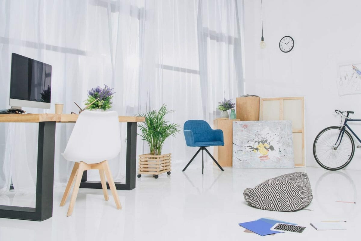
White For a Clean Slate

White paint colors are among the most popular choices for homeowners looking to brighten a space. According to a new survey, 63% of homeowners believe that the color white is mood-boosting.
White colors with blue undertones, such as SW Extra White, BM Decorator’s White, or BM White Diamond, are excellent for ceilings and walls.
Jessica Miller, a licensed mental health counselor, explains how white can give you a boost: ” It creates a sense of spaciousness and also boosts creativity. White also gives you more light reflection in the room. A dark room for a long time can reduce your creativity while having a room with proper sunlight or bright light during work can boost productivity and improve your power of thinking.”
New York interior designer Jarret Yoshida expands on using white: “Benjamin Moore white (literally no code but just BM White) is my default for my own house because I look at patterns and colors all day long. White is almost the default for most fashion and art pros in NYC, the blank paper for the dream we create for our clients. It certainly allows me to start dreaming of great ideas for others.”
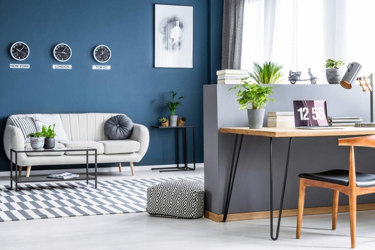
Blue For Calm, Open Minds

According to the University of British Columbia, blues are ideal for creative work environments as they promote communication, trust, and efficiency. In addition, blue is naturally calming and helps open the mind to new ideas.
Interior designer Julia Dempster offers a paint color: “Behr Winter Way is the perfect, dark, almost-black peacock color. It’s inky, majestic, and dramatic to boot.”
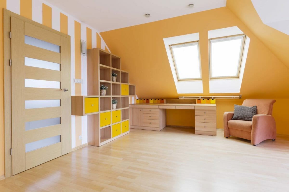
Yellow & Orange: Energizers

Yellow is a vibrant and uplifting color, often associated with creativity, optimism, and enthusiasm. Whether muted Maple Gold or a bright sunflower shade, it’s the perfect way to bring energy and cheer into any space.
It’s also said to inspire creativity and imagination, making it ideal for businesses such as advertising and graphic design.
For learning spaces, yellow can help hold attention and foster creativity, making it one of the best wall colors for education.
In the home, yellow-painted walls offer an energizing boost of positivity in any room. However, remember that more saturated yellows can be overpowering, so choose lighter shades like buttercream or lemon meringue for a softer effect.
Interior designer Bridgette Pridgen comments: “Yellow and orange are the top two colors that represent or promote creativity! Both colors are great for creativity in moderation and the right shade.
“If using yellow or orange in an office or creative space, try warm jeweled tones or lighter options such as Auric Yellow 6692 by Sherman Williams or Joyful Orange p240-7 by Behr. Using colors to promote creativity starts with accent walls or decor accents to keep the space from becoming overwhelming and overstimulating.”
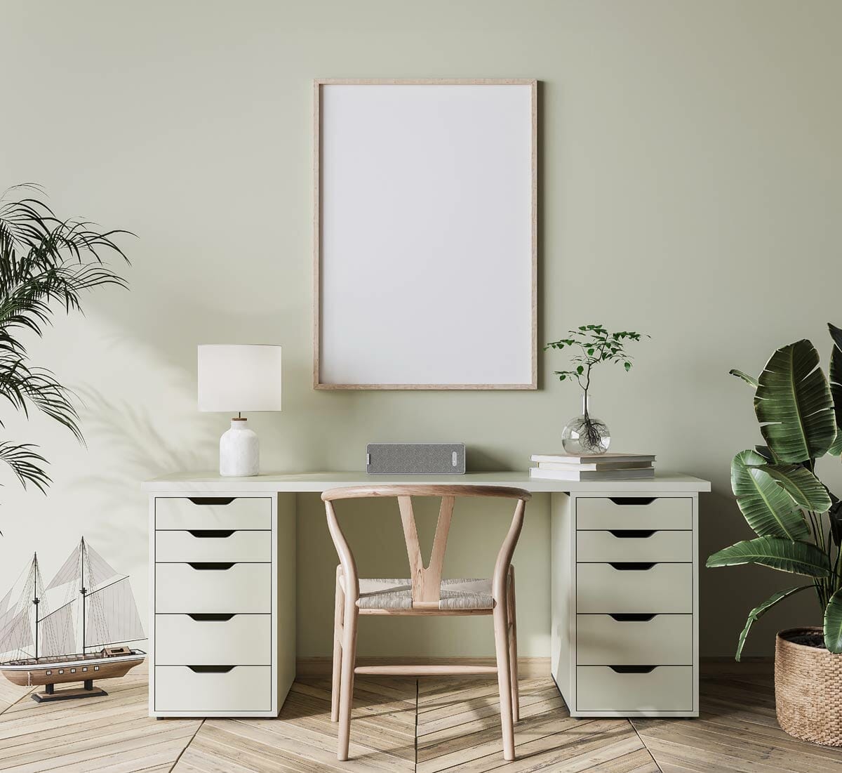
Green: Calming, Stress Buster

Green is another color that can have a positive effect on the mind. Like blue, green has a calming and soothing effect and is often used in hospitals and other environments where stress reduction is a priority.
In addition, green has been shown to increase focus and concentration, making it an excellent choice for a study or workspace.
Designer Sarah Barnard recommends it and some paint codes: “Green, in particular, is associated with natural growth and creation and can prompt creative impulses related to organic change and transformation. Morning Mist (DEW388) by Dunn Edwards is an excellent shade for common areas that may double as creative spaces. The color is very pale and soft, making it a great neutral base while still having enough of a blue hue to be reminiscent of a pale sky or frosty mornings for a color that both soothes and inspires.
“Stone Path (DE5644) from Dunn Edwards is soft pale green, saturated enough to prompt creativity with neutral characteristics for a subtle backdrop. The color is light and fresh, making it an attractive option for sunny spaces. Pine Haven (DE5713) By Dunn Edwards is a deep, enveloping green that inspires feelings of being surrounded by forest. Cool and encompassing, this atmospheric color is perfect for daydreaming, puzzling, and problem-solving.”
Bridgette recommends a mixture of green and blue: “The mixture of blue and green will boost the mind, spark ideas and life while remaining peaceful. Moscow Midnight 9142 by Sherwin Williams is a favorite paint choice for interior and exterior projects.”
Worst Paint Colors for Creativity
Just as specific wall paint colors can promote creativity and stimulate the mind, some colors can have a negative effect. Therefore, these colors are best avoided in spaces where you want to encourage creativity and problem-solving.
Muted Grays = Muted Energy
Grey is an excellent neutral color, but when it comes to creativity, it can feel cold and uninviting. In addition, it is often associated with boredom and lack of motivation and can make a space feel uninspiring and dull.
Psychologist Sarah Watson suggests avoiding it: “muted tones such as grays and whites can be draining and uninspiring. Regarding creativity, these neutral hues will only do a little to get your ideas flowing. Some of the worst paint colors for creativity are Sherwin-Williams’s Repose Gray (SW 7015), Benjamin Moore’s Edgecomb Gray (HC-173), and Behr’s Silver Drop (S100-2). Though these colors may look great, they won’t do much to encourage creativity.
“When painting a room for creativity, it’s important to keep in mind the psychological effects of color. Try to choose vibrant hues that evoke positive feelings and help you get your creative juices flowing. Steer clear of muted tones and stick with energizing colors so you can maximize your creative potential!”
Black: Use Only In Small Doses
It is a powerful and sophisticated color but can also be overwhelming and oppressive. In large doses, black can make a space dark and uninviting and inhibit creative thinking. Therefore, it is best used as an accent color rather than a wall color.
Caution: Think About Light & Finish
How Light Affects Your Paint Color Choice
The color of your walls can significantly impact the atmosphere of a room. So when choosing paint colors for your home, it’s best to test them in the room with natural light to represent how they will look accurately.
Additionally, light colors make spaces appear larger, while dark colors can make them feel smaller and more enclosed.
Make sure to assess the lighting and test out paint samples before committing to any color.
Choosing the Right Paint Sheen Level
Choosing the right paint sheen can be difficult, but with a few tips and tricks, you can find the perfect finish for any project.
When selecting a paint sheen, it is vital to consider the room or area where it will be used. In areas that experience frequent comings and goings, a glossier sheen is ideal.
For darker and richer colors, a semi-gloss or eggshell finish may be best to let more pigment show through without creating an overly shiny effect.
Matte paint sheens are good for hiding imperfections while still providing good coverage. Ultimately, selecting a paint sheen comes down to personal preference and should be chosen to best complement the desired look of the surface.
Davin is a jack-of-all-trades but has professional training and experience in various home and garden subjects. He leans on other experts when needed and edits and fact-checks all articles. Also an aspiring cook we he researches and tries all kinds of different food recipes and shares what works best.

